
- 4,320 messages
- January 18, 2012 21:37
Ik zat net te kijken of het plaatje van kavel 1 van de afgelopen veiling niet beter was dan de afbeelding die momenteel bij het betreffende catalogusitem staat. Dat blijkt inderdaad zo te zijn. Ik weet niet of de verkoper en de koper er bezwaar tegen zouden hebben als die afbeelding ter verbetering van de catalogus gebruikt zou worden.
Echter...
Bij meer nauwkeurige vergelijking blijkt dat het geveilde boek helemaal niet identiek is aan de eerste druk zoals die in de catalogus staat.
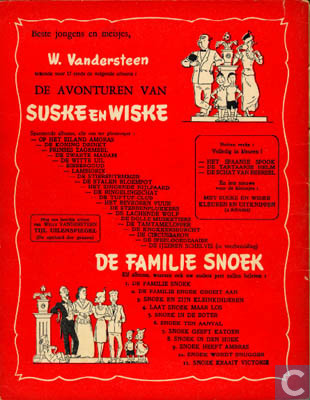
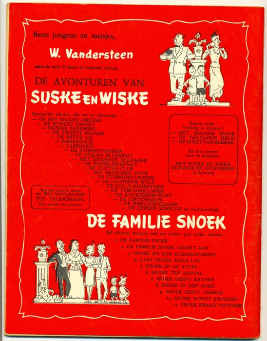
Vergelijk de achterkanten eens, en met name de onderste titels. (Ook andere details wijken af.) Kan iemand me het verschil verklaren?
P.S. Vergelijking met een grotere afbeelding van een te koop staand exemplaar maakt de verschillen duidelijker zichtbaar. Alle drie de exemplaren met eigen foto's in shops komen wel overeen met de achterkant zoals die in de catalogus staat.
I was just looking at the picture of lot 1 from the last auction was no better than the image currently in the relevant catalog item . That indeed turns out to be the case. I don't know if the seller and buyer would object if that image were used to enhance the catalog.
However ...
A more accurate comparison shows that the auctioned book is not at all identical to the first edition as it appears in the catalog.
Compare the backs, and especially the bottom titles. (Other details are also different.) Can someone explain the difference?

PS Comparison with a larger image of a copy for sale makes the differences more visible. All three copies with their own photos in shops do correspond with the back as it is in the catalog.

- Catalogue manager
- 8,580 messages
- January 18, 2012 22:09
Waar zitten de verschillen dan precies, Peter? Al geef je er maar eentje concreet aan...
Where exactly are the differences, Peter? Even if you only give one concrete ...
- 4,320 messages
- January 18, 2012 22:12
De onderste Snoek-titel (Snoek kraait victorie) staat bij het geveilde boek bijna tegen het witte kader, terwijl hij er bij het catalogus-exemplaar ver vanaf staat. De hele reeks Snoek-titels staat trouwens onder een andere hoek uitgelijnd.
Verder staat er geen dubbele punt achter de tekst "tekende voor U reeds de volgende albums".
Ook staat er in het kader rechts geen witregel tussen de tweede en derde regel.
The bottom Pike title (Snoek crow victorie) is almost against the white frame in the auctioned book, while it is far from it in the catalog copy. The whole series of Pike titles is also aligned at a different angle.
Furthermore, there is no colon behind the text "already signed for you the following albums".
There is also no blank line between the second and third line in the box on the right.
- Catalogue administrator
- 1,909 messages
- January 18, 2012 22:28
Ik vrees dat het drukproces hiervoor verantwoordelijk is. De rode kaftkleur werd eerst aangebracht alvorens de zwarte tekst er werd ingeslagen. De eerste albums ten opzichte van de laatste albums van de band kunnen waarschijnlijk wel eens verschillen doordat de drukplaten wat opgeschoven zijn.
Denk ik ...
I fear the printing process is responsible for this. The red cover color was first applied before the black text was stamped. The first albums compared to the last albums of the band can probably differ due to the fact that the printing plates have been moved a bit.
I think ...

- 1,354 messages
- January 18, 2012 22:35
Ik vrees dat het drukproces hiervoor verantwoordelijk is.
Zou kunnen, maar het is toch extreem verschillend (spatie tussen Volledig in kleuren en Het Spaanse Spook). De paginanummers (39) zijn ook verschoven tov mijn exemplaar. Kan een variant zijn.
I fear the printing process is responsible for this.
Could be, but it is extremely different (space between Full Color and The Spanish Ghost). The page numbers (39) have also shifted from my copy. Can be a variant.
- Catalogue manager
- 8,580 messages
- January 18, 2012 22:48
Het kan echt niet aan het drukken liggen, naar mijn idee.
Ik houd het op een variant die tussen de varianten a en b thuishoort.
It really can't be printing, in my opinion.
I'll stick to a variant that belongs between variants a and b.

- Catalogue administrator
- 2,917 messages
- January 18, 2012 22:55
Het verschuiven van de zwarte inktplaten lijkt me onwaarschijnlijk omdat de verschuiving niet 1 op 1 plaats vindt
het catalogus exemplaar lijnt boven met zwart rechts uit en beneden links
bij het kavel exemplaar bovenstuk in het midden en onder rechts.
Als zwart later wordt afgedrukt mag ik aannemen ineens en niet regel voor regel
maar ik ben geen graficus/drukker.
Shifting the black ink plates seems unlikely to me because the shift does not take place 1 on 1
the catalog copy aligns at the top with black on the right and at the bottom on the left
with the lot copy top in the middle and bottom right.
If black is printed later I can assume all at once and not line by line
but I am not a graphic artist / printer.

De zwarte drukgang van de achterkant is waarschijnlijk samengesteld uit losse boekdruk-clichés voor de illustraties en de getekende namen, en losse regels loodzetsel voor de titels (gemaakt op bv. een Linotype zetmachine). Als dat eenmaal goed vastgeschroefd is wijkt zo'n drukvorm geen fractie van een millimeter meer af tijdens het drukken.
Je ziet dat het rood en zwart bij het geveilde album niet goed sluitend ("in register") zijn gedrukt, maar dat doet hier niet ter zake.
De enige verklaring voor de verschillen is dat het zetsel na het drukken is losgehaald (zoals gebruikelijk) en dat voor een nieuwe oplage de achterkant opnieuw in elkaar is gezet. Met kleine verschillen, omdat het nu eenmaal handwerk was.
Het moet dus een andere druk zijn, hoewel je natuurlijk niet kunt bepalen wat de eerste en wat de tweede oplage is geweest.
Wat zou het boek hebben opgebracht als de verkoper dat erbij had gezet: "onbekende variant" ?
The black print run of the back is probably composed of separate letterpress printing blocks for the illustrations and the drawn names, and separate lines of lead type for the titles (made for example on a Linotype typesetting machine ). Once it has been properly screwed in, such a printing forme does not deviate a fraction of a millimeter during printing.
You can see that the red and black on the auctioned album are not printed properly ("in register"), but that is irrelevant here.
The only explanation for the differences is that the brew was taken off after printing (as usual) and that the back was reassembled for a new edition. With small differences, because it was simply manual work.
So it must be a different edition, although of course you cannot determine what the first and what the second edition was.
What would the book have yielded if the seller had added it: "unknown variant"?
Ook het zetwerk op de voorkant is niet helemaal hetzelfde:

The typesetting on the front is also not quite the same:

- 246 messages
- January 24, 2012 13:17
Ik denk zelf het maken van een drukplaat was vroeger handwerk was.
Daardoor ontstaat een kleine verplaatsing van de 1e tekst naar Rechts op frontcover midden onderaan en 2e tekst naar Links op frontcover midden onderaan.
Het kan ook zijn dat drukplaat niet goed geplaats is in de drukmachine waar je ook een tekst verplaatsing krijg op de frontcover midden onderaan.
I think making a printing plate myself used to be manual work.
This results in a small displacement of the 1st text to the right on the front cover at the bottom center and the 2nd text to the left on the front cover at the bottom center.
It is also possible that the printing plate is not properly placed in the printing machine where you also get a text displacement on the front cover at the bottom center.
- 4,320 messages
- January 24, 2012 14:04
En wat doen we nu met deze variant? Is er toestemming nodig van de verkoper of koper om hem op te nemen in de catalogus, of vallen afbeeldingen van de veiling automatisch onder het gebruiksrecht van Catawiki?
And what do we do now with this variant? Do you need permission from the seller or buyer to include them in the catalog, or do images from the auction automatically fall under Catawiki's right of use?

- LastDodo Team
- 6,271 messages
- January 24, 2012 15:15
Die afbeeldingen mogen gebruikt worden. Ook verkopers hebben onze algemene voorwaarden geaccepteerd waarin staat dat dat mag. Los daarvan denk ik ook niet een verkoper daar bezwaar tegen heeft.
Those images may be used. Sellers have also accepted our general terms and conditions, which state that this is allowed. Apart from that, I don't think a seller objects to that either.
- 4,320 messages
- March 23, 2012 01:16
Ook in de veiling van a.s. woensdag zit weer zo'n album dat heel licht afwijkt van het exemplaar in de catalogus. (De meeste albums die -met eigen foto- door shops worden aangeboden zijn trouwens ook afwijkende versies.)
Ter vergelijking twee achterkanten. Voor het catalogus-item heb ik de afbeelding van een shop geleend, omdat die in de catalogus te klein en onscherp is. Ik heb hulplijnen toegevoegd om de verschillen (die deze keer nog subtieler zijn) inzichtelijk te maken.
Catalogus item 27059:

Veilingkavel 116:

Met name de positionering van de eerste regel tekst onder De familie Snoek verschilt enkele millimeters (begin of midden van de A). Het is geen toevallige verschuiving in de druk, want dan zou al het zwart verschoven zijn en zouden het wit en zwart van de illustratie ook niet meer op elkaar aansluiten.
Also in this Wednesday's auction is another album that differs very slightly from the copy in the catalogue. (Most albums that are offered by shops - with their own photo - are also different versions.)
Two backs for comparison. For the catalog item, I borrowed a shop's image because it's too small and blurry in the catalog. I've added guides to make the differences (which are even more subtle this time) clear.
Catalog item 27059 :
Auction lot 116 :
In particular, the positioning of the first line of text under De Familie Snoek differs by a few millimeters (beginning or middle of the A). It is not an accidental shift in printing, because then all the black would have shifted and the white and black of the illustration would no longer match.